Unbox the Curiosity
Brand Identity Guidelines — 2026
Brand Identity Guidelines — 2026
01 — Introduction
A creative innovation lab built on curiosity, designing playful, intelligent experiences that make experimentation simple and exciting.
Brand Values
02 — Color System
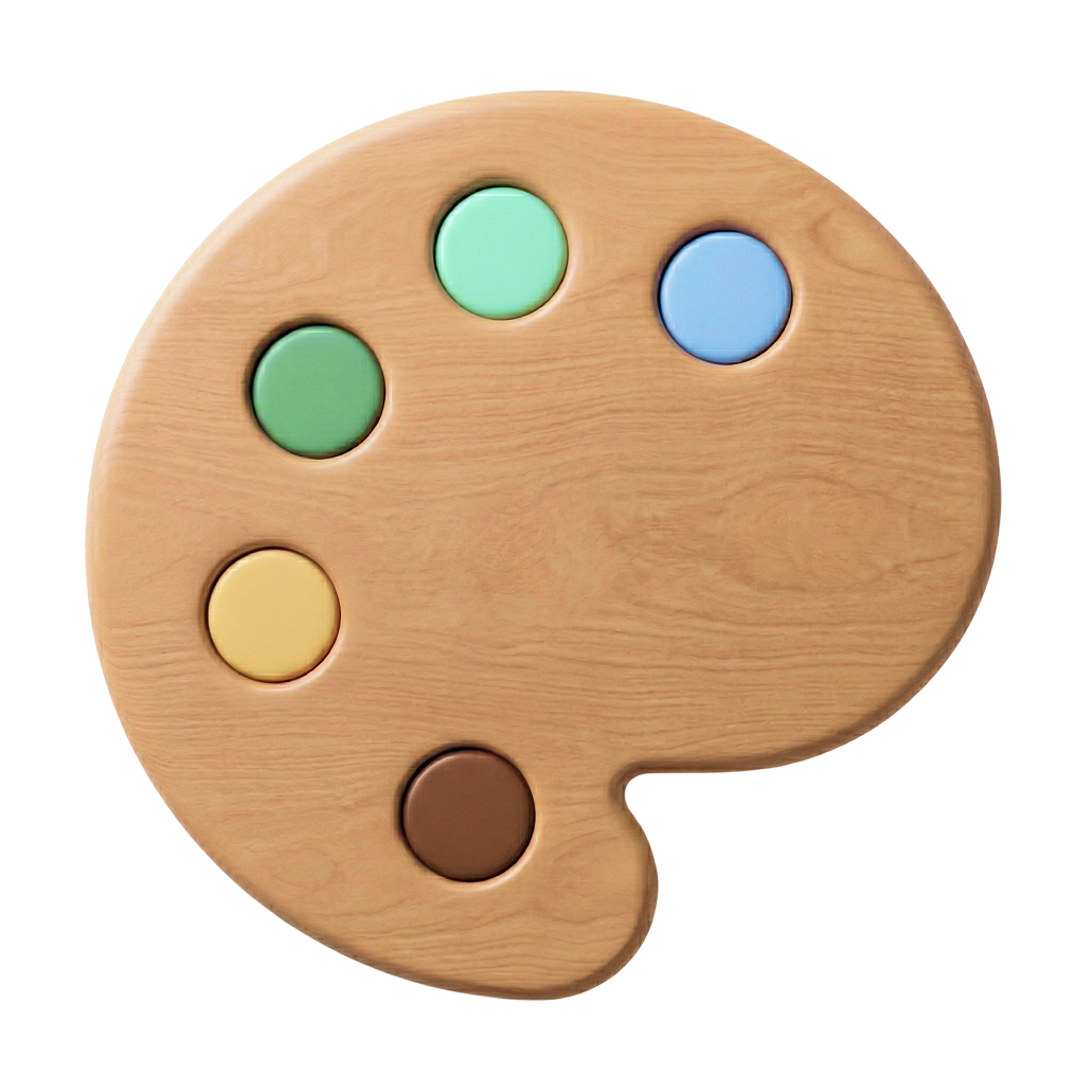
The Tinylabs palette evokes warmth and creativity. Balancing natural tones with vibrant highlights, it creates a modern visual identity grounded in nature.
Core Palette
Supportive Palette
03 — Typography
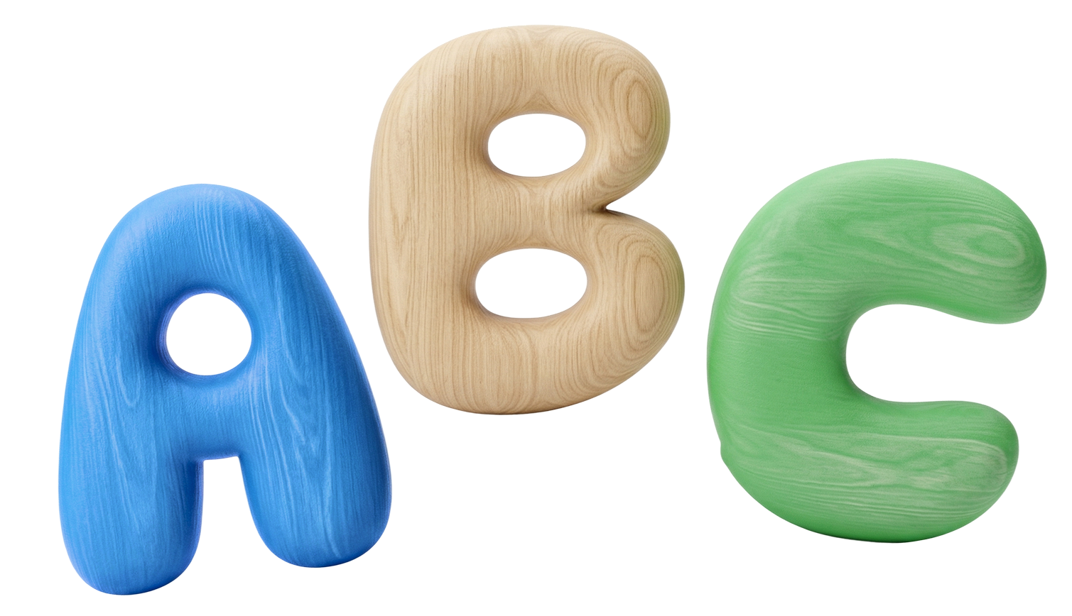
Two typefaces work in harmony — DynaPuff brings organic, playful energy; Geist delivers technological precision. Together they express the full Tinylabs story.
DynaPuff provides the “Nature and Play” half of the equation. Its distinct, character-rich letterforms bring a tactile, approachable, and playful energy that feels right at home on eco-friendly packaging.
Geist provides the “Technology and Precision” half of the equation. A highly legible, modern sans-serif tailored for digital interfaces, balancing playful headings with a clean, tech-forward aesthetic.
04 — Logo System
The Tinylabs logo represents creativity, curiosity, and approachability. Its bold, rounded form reflects playfulness, while its strong outline ensures clarity across all platforms.
Full Logo
Icon Mark

Wordmark
The Tinylabs logo must always be presented consistently and without alteration. Never distort, recolor, or alter the logo in any way not outlined in this guide.


The zone surrounding the logo defines the minimum clear space required between the logo and any other element — text, illustrations, or borders.
x

The x Unit
x equals the gap between the Tinylabs icon and word mark. All four sides require a minimum of 1.5x clear space.
When to Apply
Apply in all applications — print, digital, packaging, and environmental — without exception.
05 — Visual Language
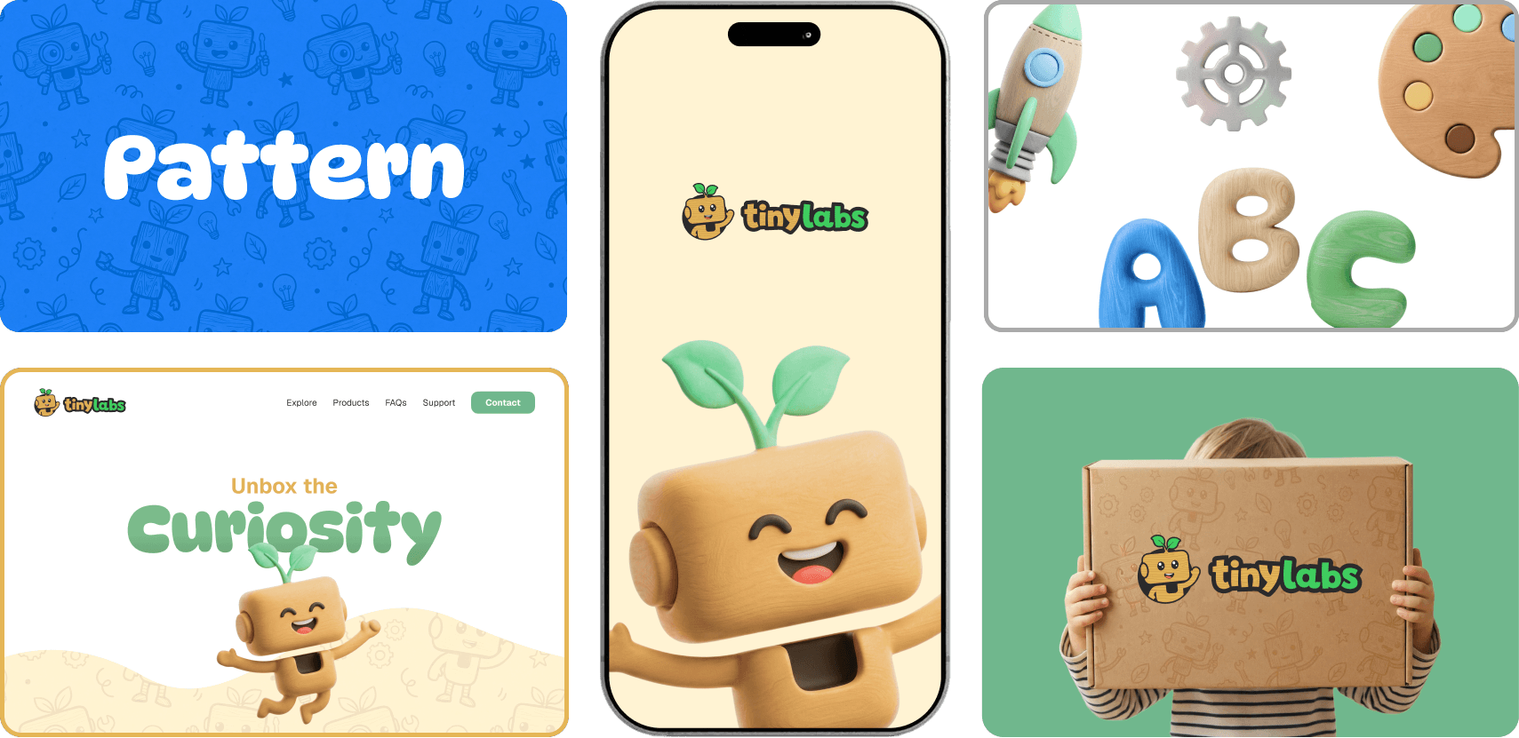
The Tinylabs visual language is rooted in one narrative: “Organic Play for Growing Minds.” Every design decision reflects this balance of warmth and intelligence.
Brand Guidelines PDF
Download the complete Tinylabs Brand Identity Guidelines document.